


The opportunities provided by e-commerce are at an all-time high. Technology is evolving, customer behavior is changing, and sales are skyrocketing. In fact, by 2020, e-commerce sales are expected to reach $4 trillion. This growth is prompting companies to ask what they can do to capture a bigger piece of this expanding market.
Website navigation is something that most companies know is important, but far too many don’t spent enough time optimizing it for maximum results. When shoppers arrive and find navigation that isn’t friendly, they click away, often straight into the arms of competitors.
Even small changes can have a serious impact on the bottom line. Here are seven strategies for improving navigation and maximizing conversions.
Draft “A” Players to the Menu
Most navigation menus are created logically based on what companies believe customers will search for without much consideration about the impact of quantity. When it comes to the number of choices available on the menu, less is always better. But why?
Psychological experiments show that a person’s short-term memory holds only a limited number of items. When you pass that limit, you start forgetting items. But what is that perfect number?
There are seven days in a week, seven colors in a rainbow, seven seas and a seven-number limit on what people will remember (it can be plus or minus a couple of items, depending on the individual). So start thinking about your navigation menu as the “A team.” There are a limited number of spots, so reserve those spots for the very best performers.
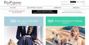
For example, check out PetsPyjamas website. The company has narrowed down its navigation menu to four items.
Key takeaway. The navigation menu should contain no more than seven items. Test different items to discover which combination produces the best results.
Order Items with Purpose
When creating the navigation menu, consider what is known as the “serial position effect,” which explains the tendency of people to recall the first and last item on a list. All those items that appear in the middle are generally lost.
For example, the last time you visited the grocery store you may have asked your significant other, “Hey, do you need anything?” He or she then rattled off several items, which you tried to commit to memory. The first few items stuck and the last items stuck — but everything else in the middle was lost. This is the serial position effect in action. But how does it apply to optimizing your navigation?
The answer is simple. Take the two most important items from your navigation list, and place those in the prime spots, which are the first and last navigation positions.
For example, if your most profitable category is shoes, you should list it first on the navigation menu, followed by another highly important category. Contact Us should be placed last. Number each page that will appear on the navigation menu by importance and place as appropriate.
Key takeaway. Ordering your navigation menu intuitively is a good start, but if you want to drive greater results, you need more. The most important items should always go first and last in the lineup.
Use Descriptive Words
Visit any website and you’ll often view general navigation headers such as Products, Services or About Us. These labels get the job done, but if you want to drive greater conversions, you need to get descriptive.
Most customers start by searching something specific, not “products” or “services.” So when you find a way to incorporate the descriptive words that customers search into your navigation headings, it creates optimized results.
For example, perhaps a customer searches for “winter boots” and locates several retail stores that offer that category of product. If you have a navigation category titled “winter boots,” that will help optimize your website and conversions.
If you aren’t sure which terms are being searched, check out the Google Keywords tool, which reveals the keywords that customers are searching to find similar products and services. There are also various analytics tools that will uncover this information.
Key takeaway. If you have a choice between listing “services” or a specific service on the navigation menu, always opt for the latter. Being specific results in a website that is instantly more optimized and relevant to customers.
Break Down Search Barriers
Site search does not get enough credit. Shoppers who use site search are some of your most profitable customers, with order values 11 percent higher than non-searchers’ order values. Evaluate your existing site search and ask, “Could it work better?”
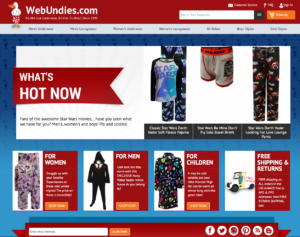
Start by placing the search bar strategically. For example, make your search bar more noticeable by changing the color so it stands out. WebUndies.com created an off-white navigation bar to ensure that users can easily find it.
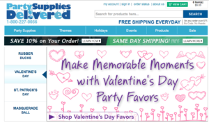
Party Supplies Delivered includes a colored button next to the search feature to make it stand out.
You can also place text inside the search bar to encourage visitors to use it. For example, you can include text such as “enter keyword or item number” to get customers started. And finally, it’s always important to ensure that your search functionality works properly and customers don’t turn up empty-handed when searching your products.
Key takeaway. Customers who use search are more likely to purchase. If your website navigation strategy does not optimize search, consider revising it. Shoppers who search are proven to convert and spend more on average. Capture these shoppers and you can quickly improve your bottom line.
Create Strategic Navigation for Different Audiences
In Lewis Carroll’s Alice in Wonderland, Alice says, “Would you tell me, please, which way I ought to go from here?” The Cheshire Cat replies, “Well, that depends a good deal on where you want to get to.” Alice says, “I don’t much care where.” And the Cheshire cat replies, “Well, then it doesn’t much matter which way you go.”
Like Alice, customers need direction. They have a general sense of where they’d like to go, but need companies to illuminate their path and make it easy. Some companies have two or more very different segments they serve. As a result, the content they need to view is distinctly different.
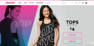
For example, clothing company Aeropostale serves both men and women. They must provide relevant experiences for both audiences, but first and foremost they need to get them headed in the right direction.
The company accomplishes this with a choice on the home page, “Shop Girls” or “Shop Guys”, which helps people navigate in the right direction.
Key takeaway. If you serve two very different segments, navigation should be optimized to lead each group quickly to the right path. Accomplishing this results in far fewer lost visitors, decreased bounce rates, and higher online conversions.
Create Fat Footers
Navigation fatigue is a real thing. To combat it, use all of your website real estate, especially that footer. This is a place where you can provide a bird’s-eye view of the site and allow users to zoom in and find what they need most.
This is also a huge SEO opportunity, because you can include commonly searched words to drive more traffic. Plus, since the footer is neatly tucked away at the bottom of the page, it doesn’t clutter up the user experience.
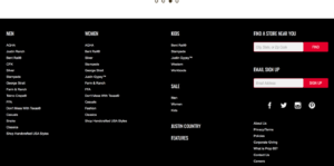
Justin Boots uses this strategy. The company, which sells high-quality boots for men and women, lists relevant SEO terms with links to their pages at the footer.
Key takeaway. Include your most important navigation terms in the header of the page, but don’t forget about the footer space. This commonly unused space can provide additional navigation and SEO opportunities.
Monitor Customer Behavior
Reach your customers and generate greater results by understanding their behavior on your website. For example, analytics tools provide insight into a customer’s journey through your website, ranging from where they originated to the various pages they visited.
Tapping into this data can help you understand overarching themes in customer navigation and behavior. For example, you may discover that a large percentage of customers are exiting your website on the same page. Why are bounce rates for this page so high? Could it be an issue with the navigation, or does the content need revising? Make changes and test the results to uncover the problem.
Key takeaway. Understand customer behavior to optimize navigation. These patterns tell a story and allow you to make changes to enhance the customer experience and drive greater impact.
Delight Your Customers
Navigation is about decreasing bounce rates and driving conversions, but at its core it’s about the customer. Strategically optimizing navigation is a time commitment for companies, but to the customer it must always feel simple. Navigation menus, search boxes, and all pieces of the puzzle must work together effortlessly to create experiences that eliminate friction.
Jeff Bezos, founder of Amazon, said, “We see our customers as invited guests to a party, and we are the hosts. It’s our job every day to make every important aspect of the customer experience a little better.” When you start thinking like a host rather than an e-commerce company, you naturally create more delightful experiences — and the conversions quickly follow.
What is SLI Systems?
At SLI, our machine-learning platform offers up the most advanced technology available to accelerate your e-commerce and continuously delight customers at every click. SLI Learning Navigation® builds dynamic navigation based on shopper behavior to guide shoppers to what they want in the fewest amount of clicks.
For more tips, check out our e-book The Big Book of Navigation Tips.